
Hi Folks, long time no see :)
After being through the whole semester. I’ve surfed through the new Datasets to work on. In this case I choose to explore on the US’s open data from the state of Virginia, which I’ve been there a decade ago. So let’s take a look what we’ve got.
- Dataset Gathering
- Dataset Preprocessing
- Data Exploration and Analysis
- Conclusion
- Resources
- References
Dataset Gathering
For this studies, I gathered the unemployment information from Virginia Labor Force and Unemployment estimates by Month by County where you could find the Historical data of unemployment from 1990 onwards.
Briefly, the data contains the number of total labor force, those who employed, and those who are unemployed by month and county. The data is uploaded into the open data portal by .csv files, so we don’t need to extract data via API endpoints.
When you take a look on ‘Period’ column, we could find the value from M1 to M13, which is informed from the author that M1-M12 represent each month in a year, while M13 means the annual average. So, in this case we will use record which period == M13 since we considered on the significant change from annual intervals than slight change from the monthly intervals.
Then — as the geographical information is involved in this studies — we will gather the geographical information using .geojson file from Virginia City/County Census Boundaries
Dataset Preprocessing
After downloading the file, we will preprocess the gathered file using the following code. We will explain what we do along with the codeworks. Mentioned that we use python for all the following code.
# download the libraries used in this studies
import pandas as pd
import geopandas as gpd
import plotly.express as px
import plotly.io as pio
import json
pandas is used for building tabular data from .csv files, best for analysis. json and geopandas is used to load and handling with .geojson files as we will mention later. Then we use plotly as data visualization library.
We need to define the plotly’s renderer before proceed. Otherwise, the visualization code using plotly will not be rendered onto output.
# define the renderer, in this case we use Visual Studio Code
pio.renderers.default = 'vscode'
Then we import the unemployment data into the workspace
# import the data
data = pd.read_csv('bls_unemployment_by_month_county.csv')
As mentioned that we will use only an annual average in analysis, we will filter it as follows
# filter for the annual average data
annual_data = data.loc[(data['Period'] == 'M13')]
In the case of the geographical data, we have something to discuss here.
First, plotly works fine with EPSG:4326 geographic coordinate system which is based on latitude-longitude while the source data is using EPSG:3857 systemwhic is the projected coordinate system. So, we need to convert the source data accordingly.
Then, as the source geojson file is pretty detailed in the coordinates between counties which consumed the rendering time, we need to simplify those coordinates for the performance purpose, save it into the new .geojson file, then import into the workspace.
# convert the source geojson from EPSG:3857 to EPSG:4236
mapdata = gpd.read_file('SDE_USDC_CENSUS_VA_COUNTY_414125723639053756.geojson')
mapdata = mapdata.to_crs(epsg=4326)
mapdata['geometry'] = mapdata['geometry'].simplify(tolerance=0.005, preserve_topology=True)
mapdata.to_file('va_county_geojson.geojson', driver='geojson')

# import the .geojson file into the workspace
with open('va_county_geojson.geojson' , 'r') as file:
    va_county_geojson = json.load(file)
Data Exploration and Analysis
Historical Unemployment Rate
We will use both historical and Geographical data to plot the historical unemployment rate by county using plotly.express.choropleth_map() as follows :
# create the choropleth map
fig = px.choropleth_map(
    data_frame=annual_data,
    geojson=va_county_geojson,
    locations="CountyName",
    featureidkey="properties.NAMELSAD",
    color="LaborForce",
    color_continuous_scale=px.colors.sequential.Blues,
    title="Unemployment Rate of Virginia - 1990 - 2024",
    animation_frame="Year",
    map_style='open-street-map',
    center={"lat": 37.9316, "lon": -78.6569},
    zoom=5,
    labels={"LaborForce": "Labor Force (Count)"},
    template="plotly_white"
)
fig.show()
Then, we got the visualization like this:
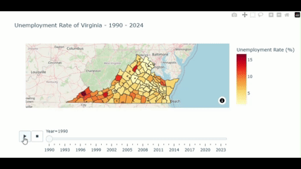
From the above figure, we could notice that the unemployment rate is noticably higher in the southwestern part compared to other part of the state. Let’s see what we find out here.
We could explore for the year and county which have the highest unemployment rate by using the following command:
# find the top 10 of county and year with the highest unemployment rate
annual_data.groupby(['Year','CountyName'])['UnemploymentRate'].max().sort_values(ascending=False).to_frame().reset_index().head(10)
And then, we got the outcome like this:
| Year | CountyName | UnemploymentRate (%) |
| 1996 | Dickenson County | 19.8 |
| 2009 | Martinsville city | 19.5 |
| 1995 | Dickenson County | 19.1 |
| 1991 | Lunenburg County | 18.8 |
| 1994 | Dickenson County | 18.5 |
| 1994 | Buchanan County | 17.9 |
| 1992 | Dickenson County | 17.0 |
| 1990 | Dickenson County | 16.8 |
| 1995 | Wise County | 16.8 |
| 2010 | Martinsville city | 16.7 |
We could see that more than Half of this output shows the county in the Southwestern part (e.g. Dickenson, Buchanan, and Wise) of the State.
Why the unemployment rate in the southern county is higher compared to the north?
- Industrial and Economic Structure: As the south Virginia’s econimy relied on the manufacturing, coal mining, and agricultural industries. Many of these industries have been experiencing the decline due to global trade, automation, and shift in domestic production. These makes the labor demand in south Virginia decreases respectively for a couple of decades.
- Educational Attainment: As the northern part is next to the D.C. so those parts gain benefit from the skilled workforce suited for various of growing sectors e.g. governments, tech, and professional services. This support the declining demand in the southern part also.
- Urban/Rural division: As mention earlier, those causes introduce the division between the urban and rural areas between the north and the south.
Then, let’s see other metrics to support those statements.
Historical Labor Force
To find out the States’ historical labor force, we still use the unemployment data file as it provided the estimate labor force of the state by county. We could slightly modify plotly.express.choropleth() method from the previous figure as follows:
# create the choropleth map
fig = px.choropleth_map(
    data_frame=annual_data,
    geojson=va_county_geojson,
    locations="CountyName",
    featureidkey="properties.NAMELSAD",
    color="LaborForce",
    color_continuous_scale=px.colors.sequential.Blues,
    title="State of Virginia Labor Force by County: 1990 - 2024",
    animation_frame="Year",
    map_style='open-street-map',
    center={"lat": 37.9316, "lon": -78.6569},
    zoom=5,
    labels={"LaborForce": "Labor Force (Count)"},
    template="plotly_white"
)
fig.show()
Then we got the visualization figure like this:
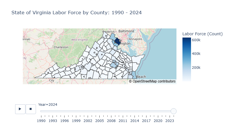
Through the 35 years of historical data, we could see the democratic structure of the State is mostly clustered at the northern county, especially in Fairfax County where the population is around 100 times more than those in the south.
Household Income
Then we explore on distribution of the Household Income so we find Median Household Income by Census County which contains the median of household income from each County from 2013 to 2023. So we need to import the data, make the slight changes on the previous visualization, then show it as follows:
# import income data
income_data = pd.read_csv('acs5_b19013_medianhhincomebycounty.csv')

# create the choropleth map
fig = px.choropleth_map(
    data_frame=income_data,
    geojson=va_county_geojson,
    locations="CountyName",
    featureidkey="properties.NAMELSAD",
    color="TotalEstimate",
    color_continuous_scale=px.colors.sequential.Greens,
    title="State of Virginia Household Income by County: 2013 - 2023",
    animation_frame="Year",
    map_style='open-street-map',
    center={"lat": 37.9316, "lon": -78.6569},
    zoom=5,
    labels={"TotalEstimate": "Annual Median Income ($)"},
    template="plotly_white"
)
fig.show()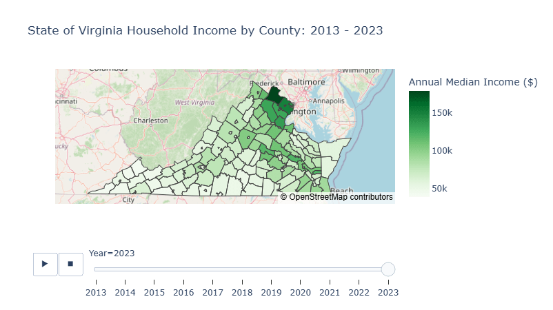
For the last 10 years, we could see that the household income in the northern part is noticeably higher than those in the south.
Conclusion
Due to shift in US’s industrial focused from the manufacturing to services during the last couple of decades plays the major role of labor demand shifts from the blue collars in the south to the skilled white collar workers in the north. Moreover, the northern counties which are not afar from the District of Colombia, the US’s capital, gains the advantage of urban growth over time.
Resources
Github: va-unemployment


Leave a comment